

10 Ways to Decorate With Pantone’s Color of the Year 2017 – Greenery || The Spruce
The results are in, and experts agree: Pantone’s choice for the Color of the Year–Greenery–is a clear winner. The muted duo of Rose Quartz and Serenity brought about a color controversy last year, and the deep blue-red of Marsala fell a little short of expectations the year before that. But Greenery seems to be a choice retailers, influencers and consumers love.
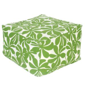
This refreshing and energizing shade of green is sure to breathe new life to any room. When I consulted Kate Smith, color expert, about how the various shades of green affect one’s mood, she cited greens–like emerald–as a color associated with wealth and success. Shades of green found in nature promote new beginnings and harmony. And more yellow-based greens–like apple–boost energy and revitalize a room.
This year’s Greenery seems to fall in the latter category; it has burst onto the scene with a bold new spirit. Style directors from a variety of different brands have lots to say about the Color of the Year for 2017. Read on for the top four reasons to use Greenery as an accent color in your home.
Greenery as a Way to Get Organized
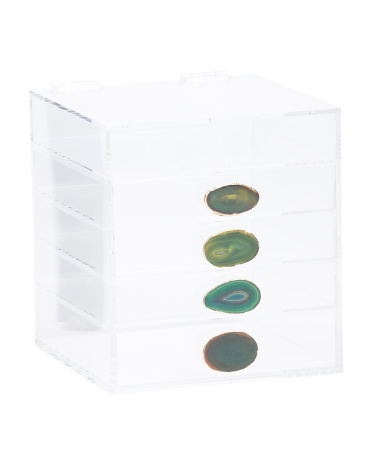
Amelia Meena, style expert for T.J.Maxx and Marshalls, sees green’s harmonizing potential as a way to promote balance and order through home organization pieces such as these acrylic storage drawers with trendy agate knobs. She says,
“Pick a color scheme to unify the space–too many colors offer competing aesthetics that add to existing clutter. Greenery, is a perfect choice to evoke a sense of renewal and freshness within any decor setting.”
And, Amelia points out, Greenery just happens to match well with organizing basics in “natural tones (think: woven baskets, wooden bins), modern lines (think: glossy white and clear acrylic) and most everything in between, giving you plenty of organization combos.”
And don’t forget about kids’ spaces, which are prone to lots of clutter. “Kids love color,” Amelia points out. “So create a color system for their clothes, toys or schoolwork to help teach them organization. And what better color to work with than Greenery?” Certainly, it’s an energetic, youthful shade of green and it works well with other bright and kid-friendly colors often found in playrooms. As an added bonus, making playtime cleanup simpler means kids of any age can get involved.
There’s no doubt about it: Pantone chose a fan-favorite this year with Greenery. It has the potential to transition spaces through the seasons; lend a contemporary organic feel; breathe life into existing rooms; and bring harmony and balance into a home, all of which will make it one of the more popular choices for Color of the Year in quite some time.
December 2016
The Spruce
Read original article here >